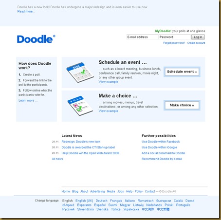
This makes it easier to figure out what to do with the program, and the sleeker and more professional-looking graphics makes me wonder about how they are demonstrating they want to break into the big leagues. Good for them! They have a simple product and do not make us users jump through all sorts of hoops to use it. Simple account set-up, easy-to-edit scheduling, and few ads. All around, a nice service to use. I have found Doodle even easy to use with technology newbies, which is often an audience with which I directly work.
They are a model for how Web firms should focus on their core competency and perfect what they begin before they expand into trying to do everything.

Agreed, Doodle have an excellent service, and great business model. Even the technologically nervous find it a breeze.
Jeffrey, thanks for the great review! We’re glad to hear that you like the new design.
@Ed Webb & @myke
Doodle is such a great service, I wish I would have either thought of it myself or somehow been an early employee! Why try to do everything when that is impossible; instead focus, focus, focus!
Besides looking more web2.0ish I don’t see what difference it makes. doodle is very useful for face to face meetings but if you meet with people online their time zone interface is awful. I’m using http://www.scheduleonce.com
Michael, what would we need to improve with regard to our timezone interface? We’re always interested to hear about opprtunities to improve the interface. Thanks!